Windows Presentation (WPF) offers a set of services that can be used to extend the functionality of a type’s property. It contains special functionalities that were introduced in the WPF property system. We give an overview of the WPF property system and the abilities of a dependency property. We will also show you specialised aspects of the dependency properties such as dependency property metadata and how to implement your own dependency property using a custom class.
Dependency Properties vs CLR Properties
The aim of dependency properties is to provide a way to calculate the output value of a property based on the value from other inputs. These other inputs can consist of themes and user preferences, data bindings and animations/storyboards. They can also be templates such as resources and styles or values known through other elements in the element tree.
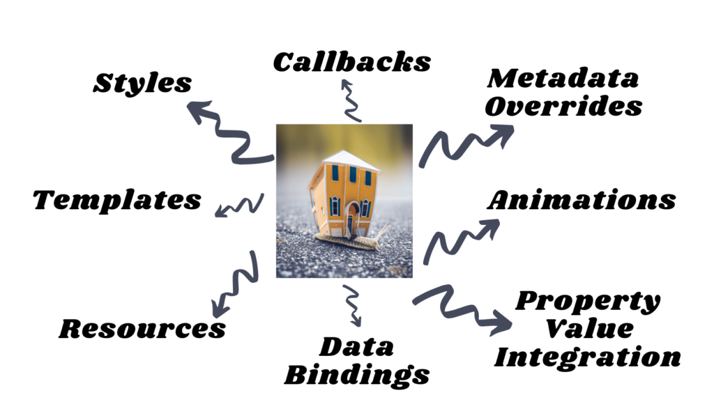
Dependency properties are implemented to provide self-contained validation, default values, callbacks that monitor property changes and other runtime information based values. You can also override an existing dependency property metadata rather than overriding a dependency property or creating new properties. Dependency properties can also be bound to XAML as well (rather than just code).
CLR Properties are a wrapper around private variables using getter and setter methods to store and retrieve values. The CLR properties can directly read and write by the private member of a class. On the contrary, dependency properties are not stored in a local object. Rather they are stored as Dictionary key-value pairs provided by the DependencyObject class. The key is the name of the property, whereas the value is the value you want to set.
Why do we need them?
There are several reasons why we need to use dependency properties, here are a few of them:
Less Memory Consumption
Rather than storing the property every time, the property is only stored when it is changed or modified. This decreases the amount of memory used.
Property value Inheritance
It traverses up the tree until it finds a value. This means that if there’s no value set for the property, it will traverse up until it finds a value.
Change Notification and Data Bindings
Whenever a property modifies its value, it notifies the DependencyProperty using INotifyPropertyChange. This will help in data binding as the value is reflected immediately with the new changes.
Resources, Animation, Styles and Templates
You can define resources such as images or shapes. Also, a dependency property is able to animate, set styles and provide templates for the specific control.
CallBacks
When a property is changed (as mentioned above), a callback method is invoked. This is useful for when you want to update an element in UI when a property changes.
Overriding Metadata
Overriding metadata from a derived property can be done without having to redefine or reimplement the entire dependency property definition.
Setting Property Values in XAML vs Code
You can set the properties in either code or XAML.
In XAML, there are a number of syntax forms to use when setting properties. The syntax will depend highly on the particular property in hand. Here is an example of setting button properties in XAML:
<Button Background="Blue" Content="Click Me!"/>On the other hand, if you wish to write in code:
Button myButton = new Button();
myButton.Background = Brushes.Blue;
myButton.Content = "Click Me!";
You can also mix the two by setting properties in XAML and changing it later in code behind.
Dependency Property Functionalities
Now that we know how to define dependency properties, let’s take a look at the different functionalities provided by a dependency property.
Resources
A dependency property can be set by referencing a resource. Resources can be dynamic or static. For example, let’s say you want to define the colour of a brush as a resource.
<Application.Resources> <SolidColorBrush x:Key="MyBrush" Color="Pink"/> </Application.Resources>In this case, you can use the resource once it’s defined inside your control:
<Button Background="{DynamicResource MyBrush}" Content="My favourite colour" />When using a dynamic resource, you create a temporary expression during the initial compilation and avoid making lookups for resources until the requested resource is actually required to construct the object. For example, after the page is loaded.
Also note that when using resources, if you set another local value, it will replace the resource reference.
Data Binding
A dependency value can contain an object through data binding. When using data binding, the final property is determined after run time and then the value is obtained from a data source. The data binding uses a specific markup extension syntax in XAML or the Binding object in code.
<TextBlock Grid.Row="0" x:Name="txtVideoName" Text="{Binding ElementName=_this, Path=VideoName}"/>The above example sets the Text property in a TextBlock and binds it to a dependency property value ‘VideoName’ (see custom dependency properties section to learn how to use dependency properties that can be bound to a control)
Styles
Styles and templates are the most important uses of using dependency properties. Styles are especially helpful for setting properties that define UI. Styles are usually defined as resources in XAML Styles contain setters to interact with the property system and triggers to change the property value based on real-time value for another property.
<Style x:Key="BlueGrayButton" TargetType="{x:Type Button}">
   <Setter Property="FontFamily" Value="Segoe UI"/>
   <Setter Property="FontSize" Value="15"/>
   <Setter Property="Padding" Value="10,4"/>
   <Setter Property="Focusable" Value="False"/>
   <Setter Property="Template">
      <Setter.Value>
         <ControlTemplate TargetType="{x:Type Button}">
            <Grid Name="grid" Background="{Binding Path=(common:NormalBackground), RelativeSource={RelativeSource TemplatedParent}}">
               <Border Name="_border"/>
               <ContentPresenter Name="_content" Margin="{Binding Path=(common.ContentMargin), RelativeSource={RelativeSource TemplatedParent}}" VerticalAlignment="Center" HorizontalAlignment="Center"/>
            </Grid>
            <ControlTemplate.Triggers>
               <Trigger Property="IsEnabled" Value="false">
                  <Setter TargetName="_border" Property="Background" Value="DarkGray"/>
               </Trigger>
               <Trigger Property="IsEnabled" Value="true">
                  <Setter TargetName="_border" Property="BorderBrush" Value="Transparent"/>
               </Trigger>
               <Trigger Property="IsMouseOver" Value="true">
                  <Setter TargetName="_border" Property="BorderBrush" Value="Blue"/>
                  <Setter TargetName="_border" Property="BorderThickness" Value="2"/>
               </Trigger>
            </ControlTemplate.Triggers>
         </ControlTemplate>
      </Setter.Value>
   </Setter>
</Style>
The above example shows how you can style a button to use different values for properties such as changing its background and font family. Also, note how you can add multiple triggers such as changing properties when the mouse is over the button or if the button is disabled/enabled.
Animations
Dependency properties can be animated. For example, a button can animate its background by time or a window can fade-in and out. Here is an example of a button that animates its background. The SolidColorBrush is the target property that is animated from value Blue to Green for a duration of 5 seconds. You can also choose if the behaviour is repeated and if its auto-reverse (meaning green to blue and vice versa).
<Button Content="I am a button">
   <ButtonBackground>
     <SolidColorBrush x:Name="AnimatedBrush"/>
   </Button.Background>
   <Button.Triggers>
     <EventTrigger RoutedEvent="Button.Loaded">
         <BeginStoryboard>
            <Storyboard>
            <ColorAnimation Storyboard.TargetName="AnimatedBrush" Storyboard.TargetProperty="(SolidColorBrush.Color)"
                           From="Blue" To="Green" Duration="0:0:10" AutoReverse="True" RepeatBehavior="Forever" />
            </Storyboard>
         </BeginStoryboard>
      </EventTrigger>
   </Button.Triggers>
</Button>
Metadata Overrides
You can modify the way the dependency property behaves by overriding its metadata when you inherit from the class that originally registered the dependency property. The example below overrides metadata for the property of DefaultStyleKey. In this way, you can create your own Spinner derived from default styles from Spinner themes.
public class SpinnerControl : ItemsControl
{
   static SpinnerControl()
   {
     DefaultStyleKeyProperty.OverrideMetadata(
     typeof(SpinnerControl),
     new FrameworkPropertyMetadata(typeof(SpinnerControl)));
   }
}
Property value Inheritance
An element is capable of inheriting the value of a dependency property from its parent in its object tree. However, due to the performance impact inheritance has, not all dependency properties can inherit from other dependency properties. An example of this is setting the FlowDirection property in the level in the element tree that encompasses the presentation need for each page in the application.
Custom Dependency Properties
In WPF, you can define your own custom dependency properties. Here is a step-by-step process of how to define custom dependency properties in C#:
1. Declare and register your dependency property using system call register
2. Implement a getter and setter for the property.
3. Define a static handler that will take care of handling any changes globally
4. Define an instance handler that will take care of handling any changes locally
Here is an example of the steps mentioned above in the C# code:
public partial class ReisterUserControl : UserControl
{
    public RegisterUserControl()
    {
        InitializeComponent()
    }
    //declare and register dependency property
    public static readonly DependencyProperty SetUsernameProperty = DependencyProperty.Register("SetUsername", typeof(string),
                    typeof(RegisterUserControl), new PropertyMetadata("", new PropertyChangedCallBack(OnSetUsernameChanged)));

    //implement setter and getter
    public string SetUsername { get { return (string)GetValue(SetUsernameProperty); } set { SetValue(SetUsernameProperty, value); } }

    //Define a static handler that will take care of handling any changes globally
    private static void OnSetUsernameChanged(DependencyObject d, DependencyPropertyChangedEventArgs e)
    {
        RegisterUserControl registerControl = d as RegisterUserControl;
        registerControl.OnSetUsernameChanged(e);
    }

    //Define an instance handler that will take care of handling any changes locally
    private void OnSetUsername(DependencyPropertyChangedEventArgs e)
    {
        txtUsername.Text = e.NewValue.ToString();
    }
}
And here is the XAML code that creates a user control and initializes the SetUsername dependency property:
<Window x:Class = "WpfApplication.MainWindow" xmlns = "http://schemas.microsoft.com/winfx/2006/xaml/presentation" xmlns:x = "http://schemas.microsoft.com/winfx/2006/xaml" xmlns:views = "clr-namespace:WpfApplication" Title = "MainWindow" Height = "500" Width = "300">
    <Grid>
          <views:RegisterUserControl SetUsername= "username1"/>
    </Grid>
</Window>
